Selco Credit Union
Website Redesign
SELCO Credit Union partnered with our team to redesign their website, with the goal of creating a more intuitive, accessible, and visually cohesive experience for both existing members and prospective users.
As a community-focused credit union, it was important that the new experience felt approachable, easy to navigate, and reflective of their Pacific Northwest roots, while also improving usability across devices.
ROLE: UX/UI Design
TOOLS: Sketch, , Adobe Photoshop, Miro
Discovery & On-Site Workshop
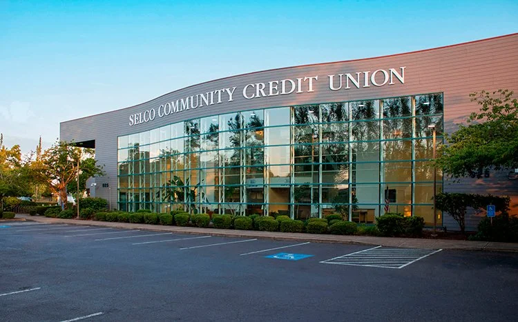
To kick off the project, our team traveled to SELCO Credit Union’s headquarters in Eugene, Oregon to lead an in-person discovery session with key stakeholders.
Through a series of collaborative workshops, we aligned on business goals, user needs, and success metrics for the redesign. We reviewed pain points in the existing experience, evaluated site performance, and identified opportunities to improve navigation, clarity, and overall usability.
We also worked closely with internal teams to better understand SELCO’s audience segments, core services, and long-term vision. These insights helped define a strategic foundation that guided the design approach and ensured alignment across teams.
Approach
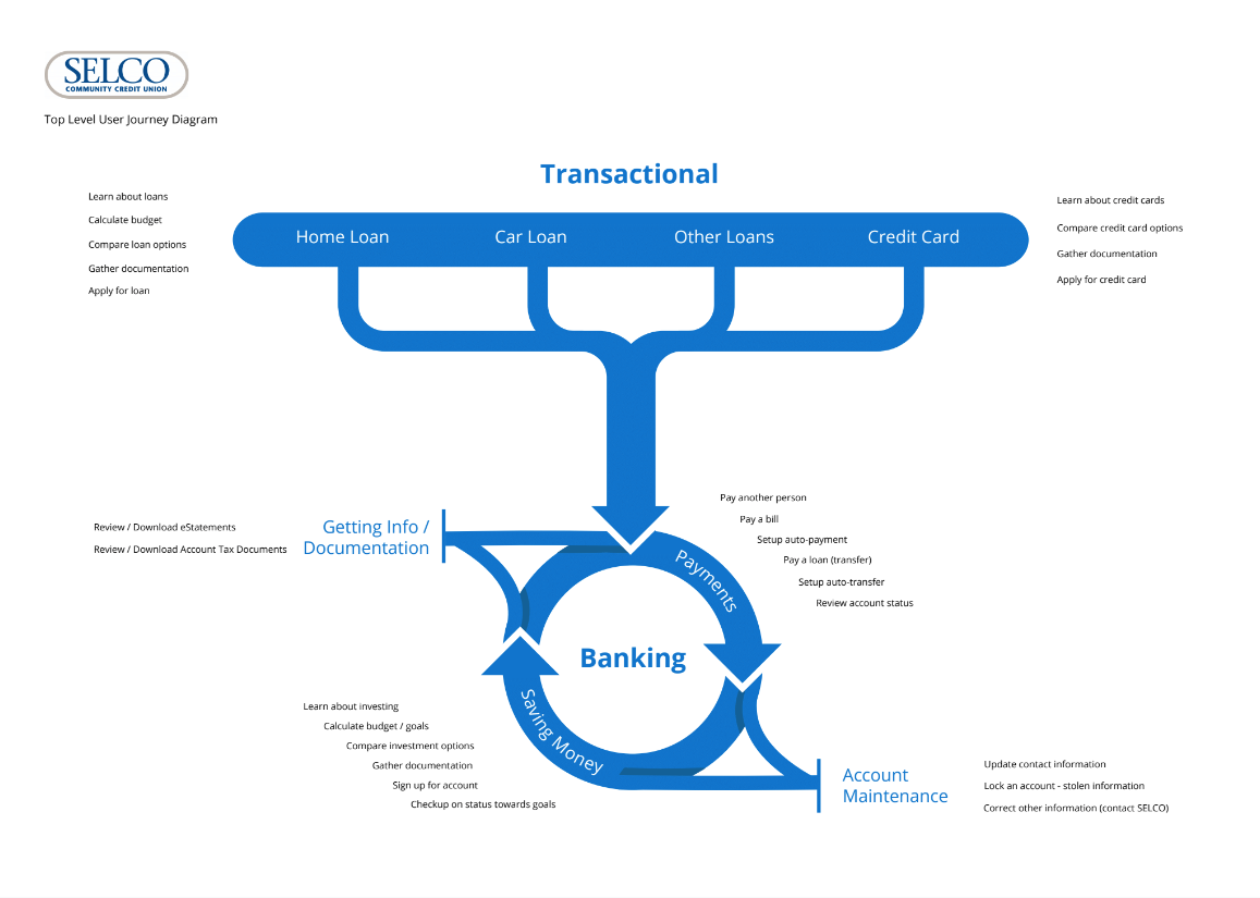
Based on discovery insights, our focus was to simplify the user experience while making key information more accessible across all user types.
We prioritized homepage content based on user needs and business goals, ensuring that both existing members and potential customers could quickly find relevant information. By mapping user personas and behaviors, we developed a clear site architecture and user flows that reduced friction and improved overall navigation.
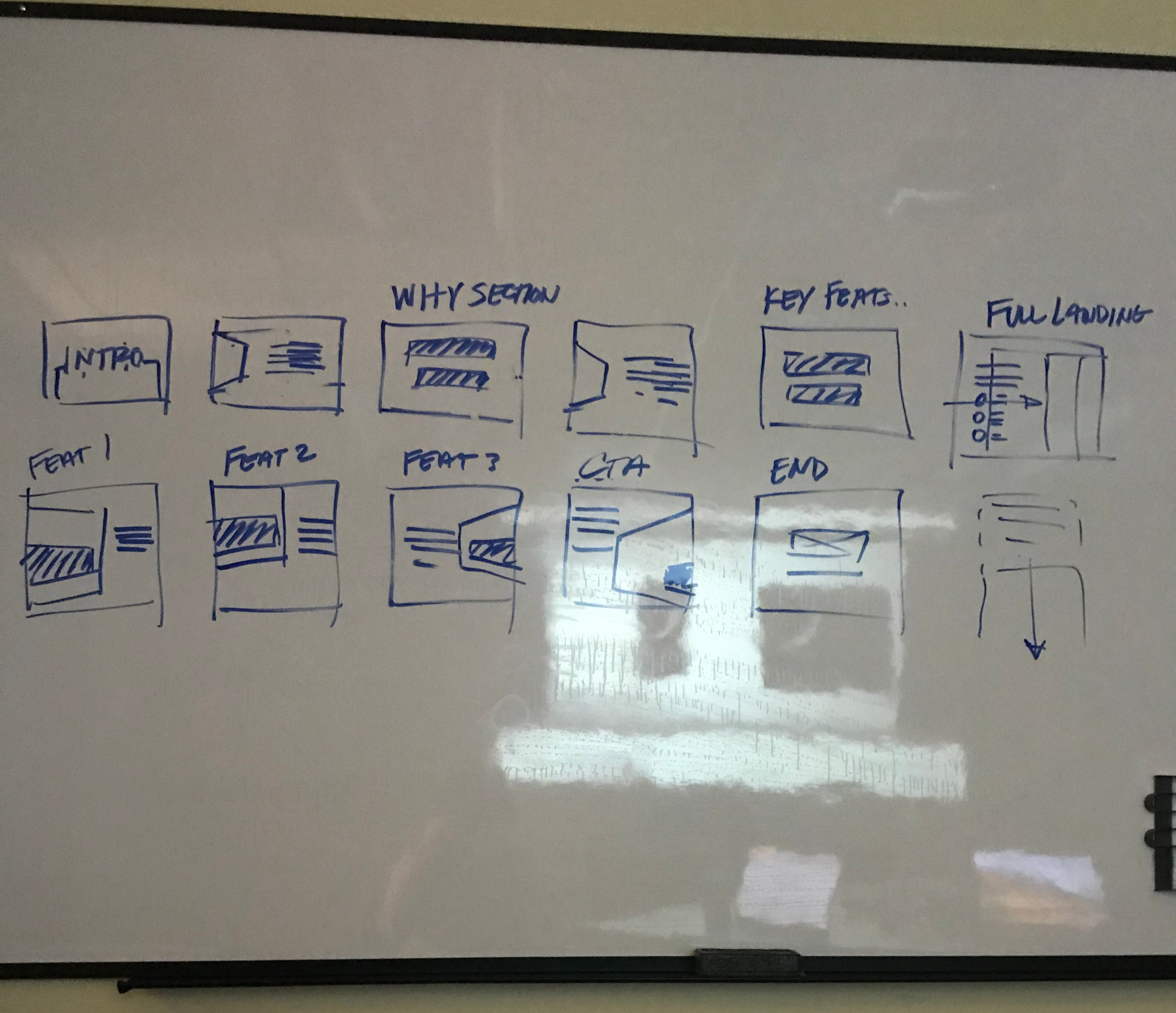
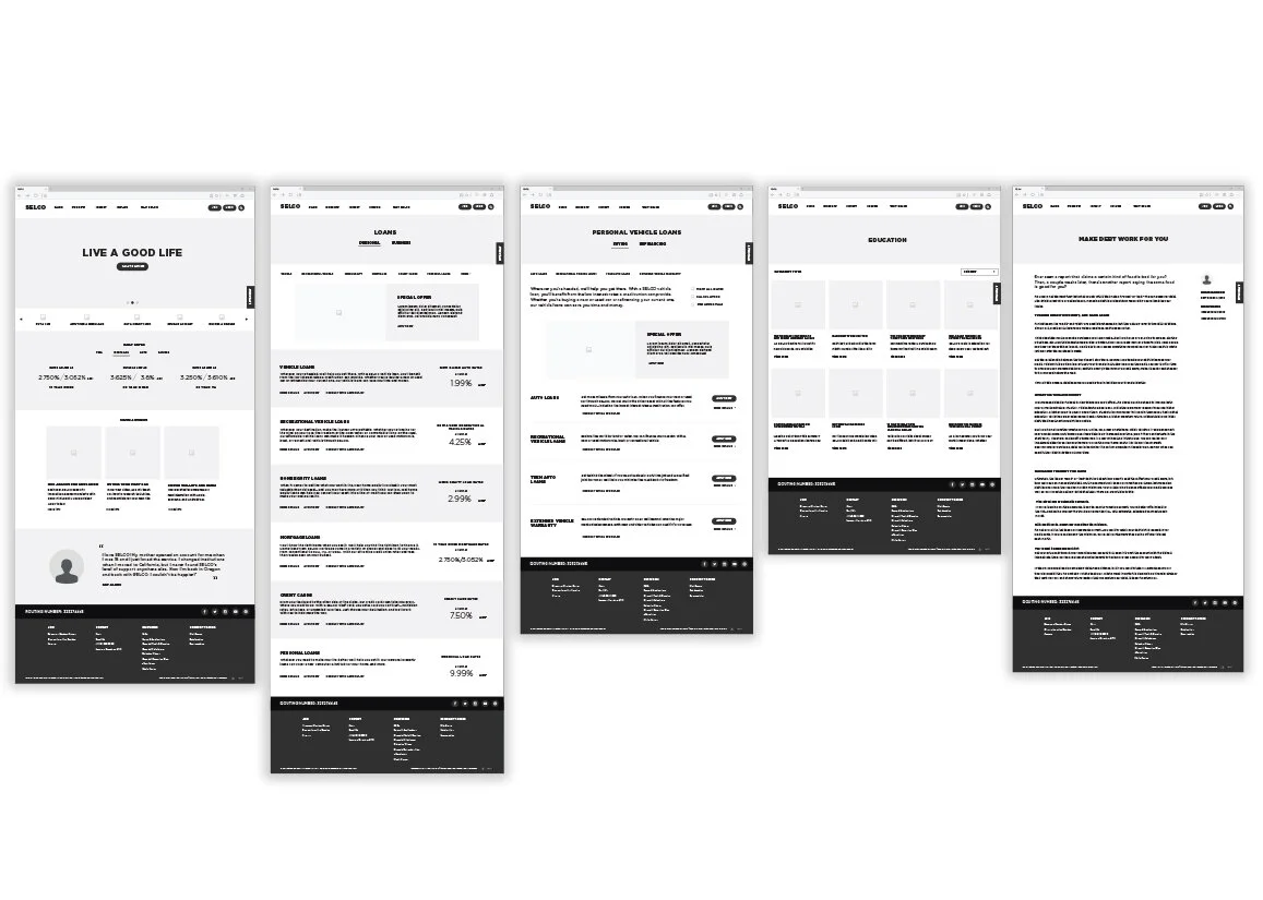
Wireframing
We translated these insights into wireframes that established a clear structure and hierarchy across the site.
Working closely with stakeholders, we refined layouts to ensure key actions and information were easily accessible, particularly on the homepage. The wireframes focused on creating a logical flow, improving usability, and supporting a seamless experience across desktop and mobile devices.
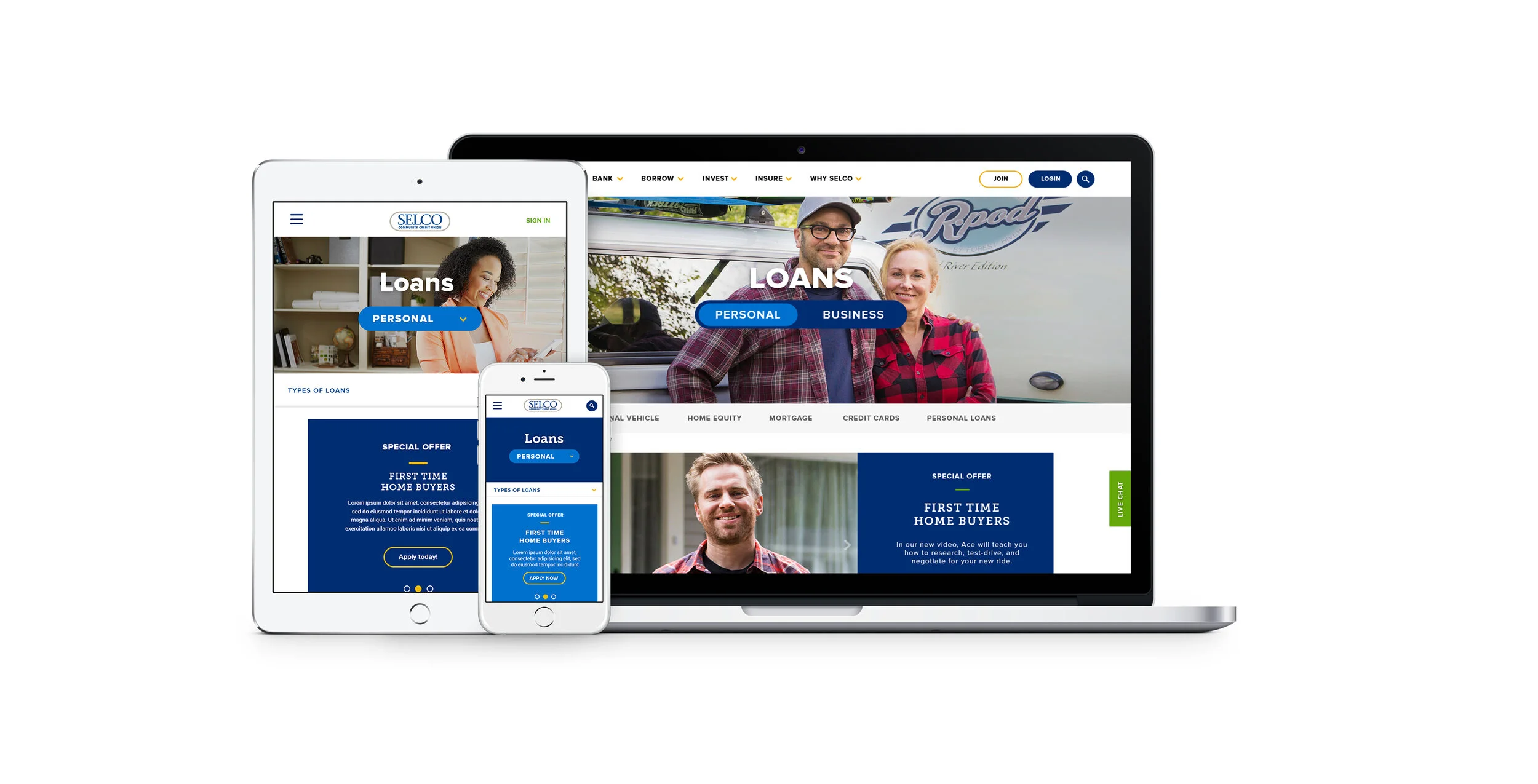
Visual Design
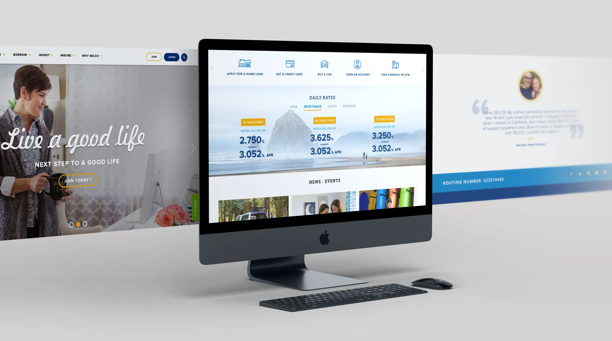
The visual design focused on creating a clean, approachable, and brand-aligned experience.
I incorporated rounded UI elements inspired by SELCO’s logo, and used a card-based layout system to organize content in a way that felt structured yet open. Full-width imagery was used strategically to break up content and create visual rhythm throughout the site.
To reinforce SELCO’s identity as a community-driven, Pacific Northwest credit union, we selected imagery that reflected their local environment and audience. The color palette remained rooted in their existing brand, using blue, green, and yellow tones, while emphasizing clarity and readability across all content.
Outcome
The redesigned experience improved usability and accessibility across devices, with SELCO reporting a significant increase in mobile adoption, particularly among users aged 40+.
Beyond performance improvements, the new site established a more cohesive and modern brand presence, making it easier for users to navigate and engage with key services. The success of the redesign strengthened the client relationship and led to ongoing collaboration on future marketing initiatives.