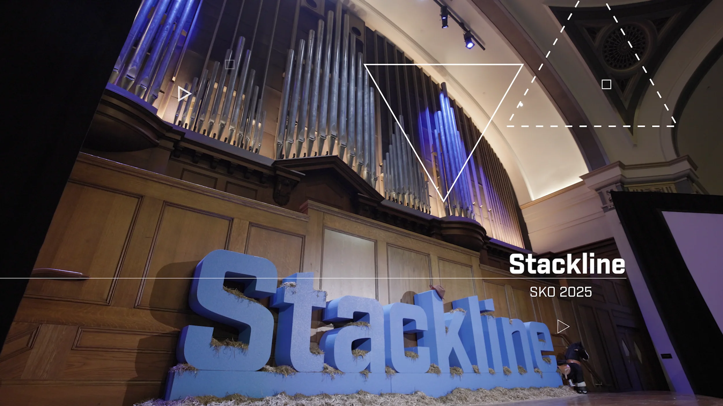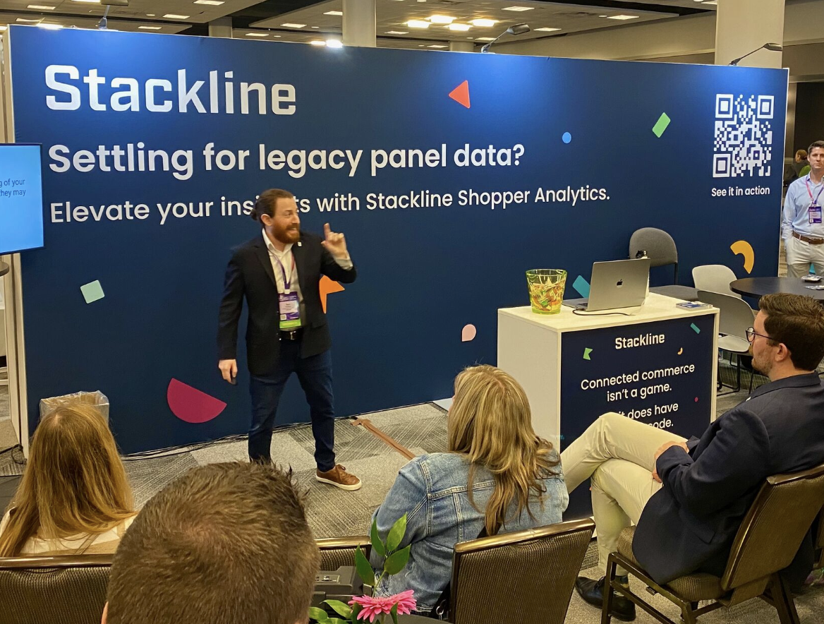
Brand Identity
As Stackline evolved from an early-stage startup into a more established SaaS platform, its original brand identity no longer reflected the sophistication, scale, or credibility of the business.
The goal of this project was to modernize the brand, create a more distinctive visual identity, and better position Stackline as a trusted, enterprise-ready platform.
ROLE
Lead Brand Designer
SCOPE
Logo Design • Visual System • Stakeholder Collaboration
TOOLS
Adobe Illustrator
ChallengeThe existing logo relied on a stock icon paired with generic typography, which limited brand recognition and failed to differentiate Stackline in a competitive market.
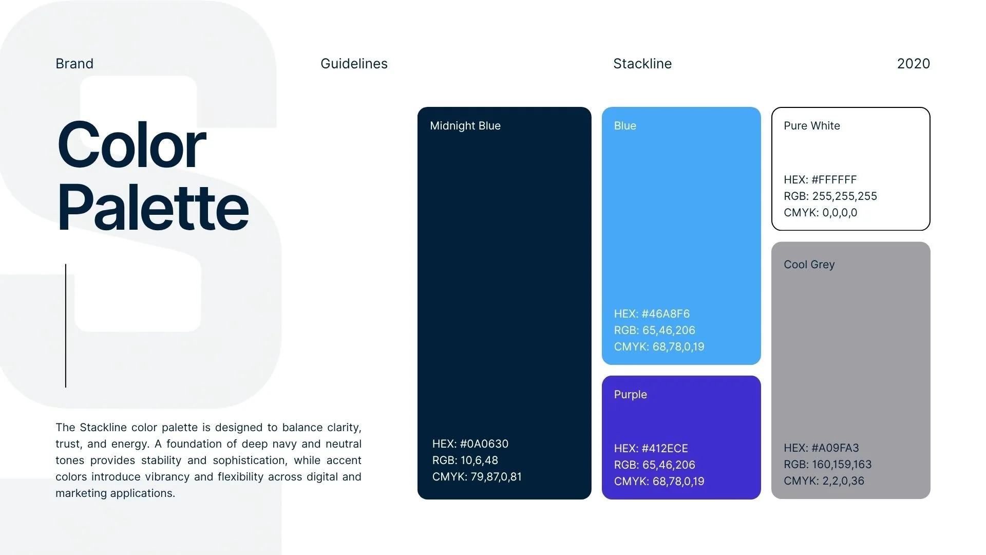
Additionally, the existing light blue color palette lacked the depth and authority needed to convey trust and stability, particularly for enterprise clients.
ApproachI led the exploration of a new visual direction that would feel more custom, intentional, and aligned with Stackline’s growth.
This included:
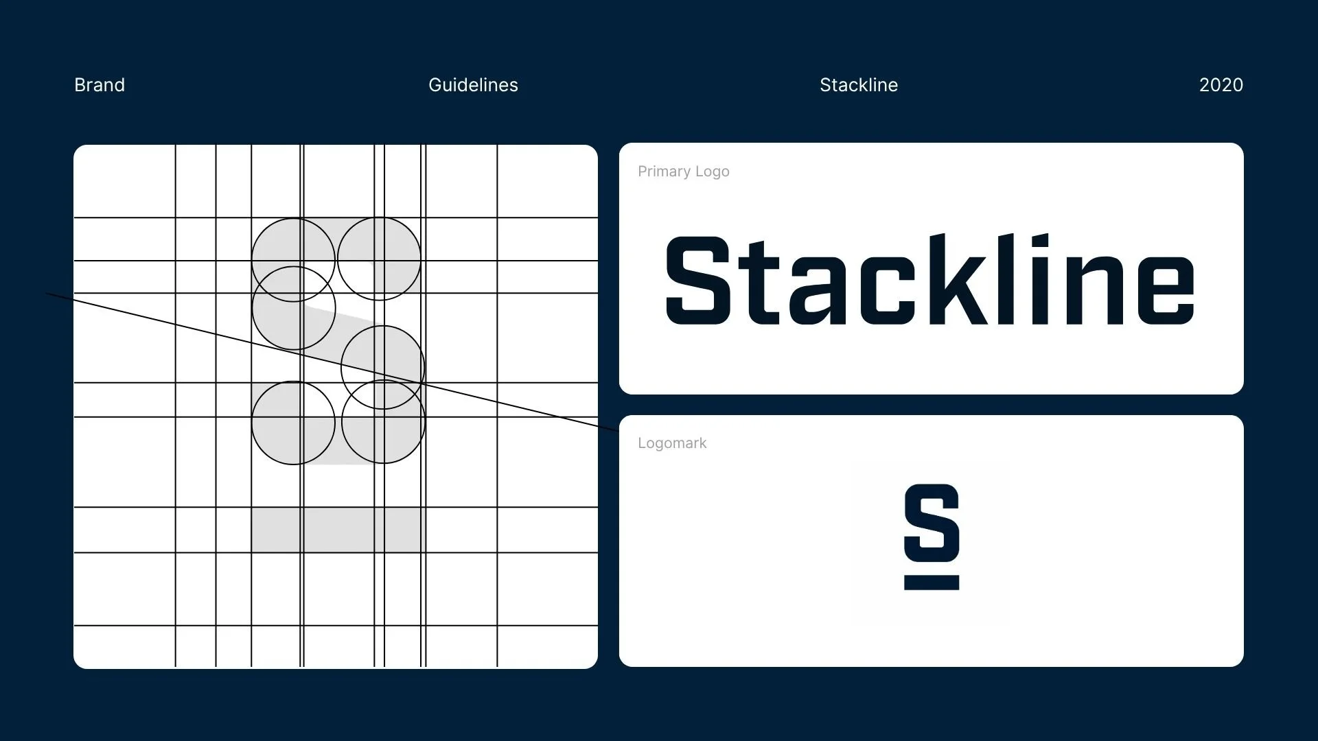
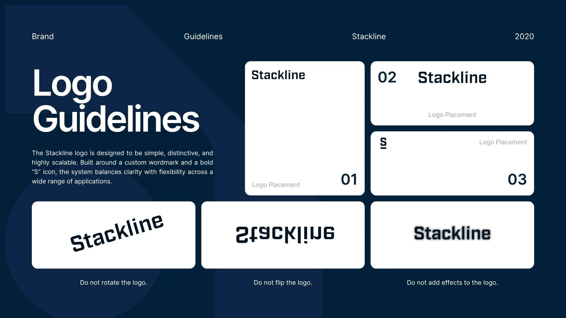
Designing a custom wordmark to create a more ownable and recognizable identity
Developing a simplified emblem that could scale across product and marketing surfaces
Exploring color variations to better reflect the brand’s positioning
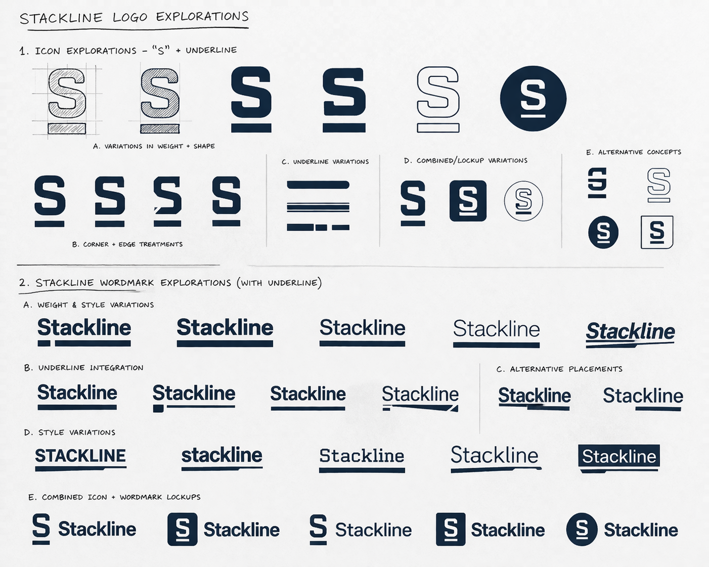
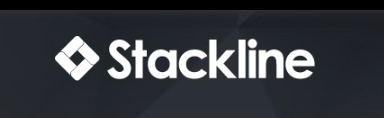
SolutionThe final identity introduced a custom wordmark paired with a refined emblem, replacing the previous stock-based mark with something more distinctive and scalable.
We transitioned from a lighter blue to a deeper navy tone to signal trust, stability, and maturity, aligning with both user feedback and broader perception trends within enterprise and SaaS brands.
A subtle linear element was incorporated into the mark to reinforce a sense of strength, precision, and forward momentum. The upward-trending lines also subtly reference Stackline’s data-driven platform, visually echoing growth, performance, and positive trajectory.
OutcomeThe updated brand system established a stronger, more credible visual presence, better aligning with Stackline’s positioning as a growing technology company.
The shift to a more refined identity improved brand consistency across product and marketing touchpoints, while the updated color palette and custom mark helped reinforce trust with users.
This work laid the foundation for a more scalable brand system that could evolve alongside the company’s continued growth.