OPS
I had the privilege of revamping the branding and homepage of OPS, a specialized division of Össur, USA, that partners with healthcare professionals to provide orthotic and prosthetic services to individuals with disabilities. My objective was to infuse a contemporary touch and establish a distinct identity for the OPS division.
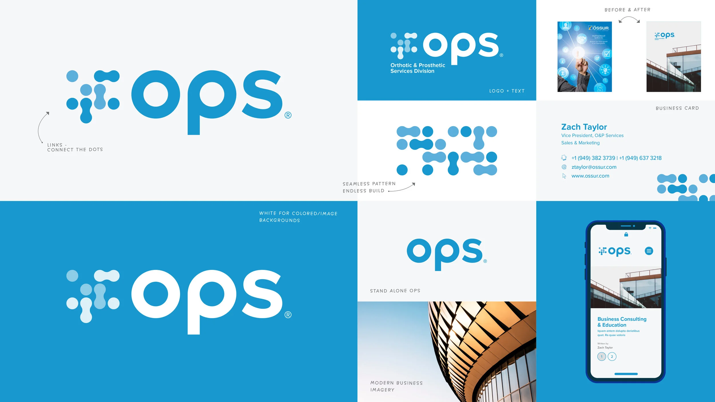
Branding refresh
I collaborated with OPS stakeholders to develop several new visual concepts. Ultimately, we agreed on a sleek sans serif font and a seamless pattern of interconnected dots to symbolize OPS's mission of "Connecting the dots" for their patients and delivering innovative prosthetics. To maintain brand consistency, we used Össur's established color palette.
TOOLS USED: Adobe ILLUSTRATOR
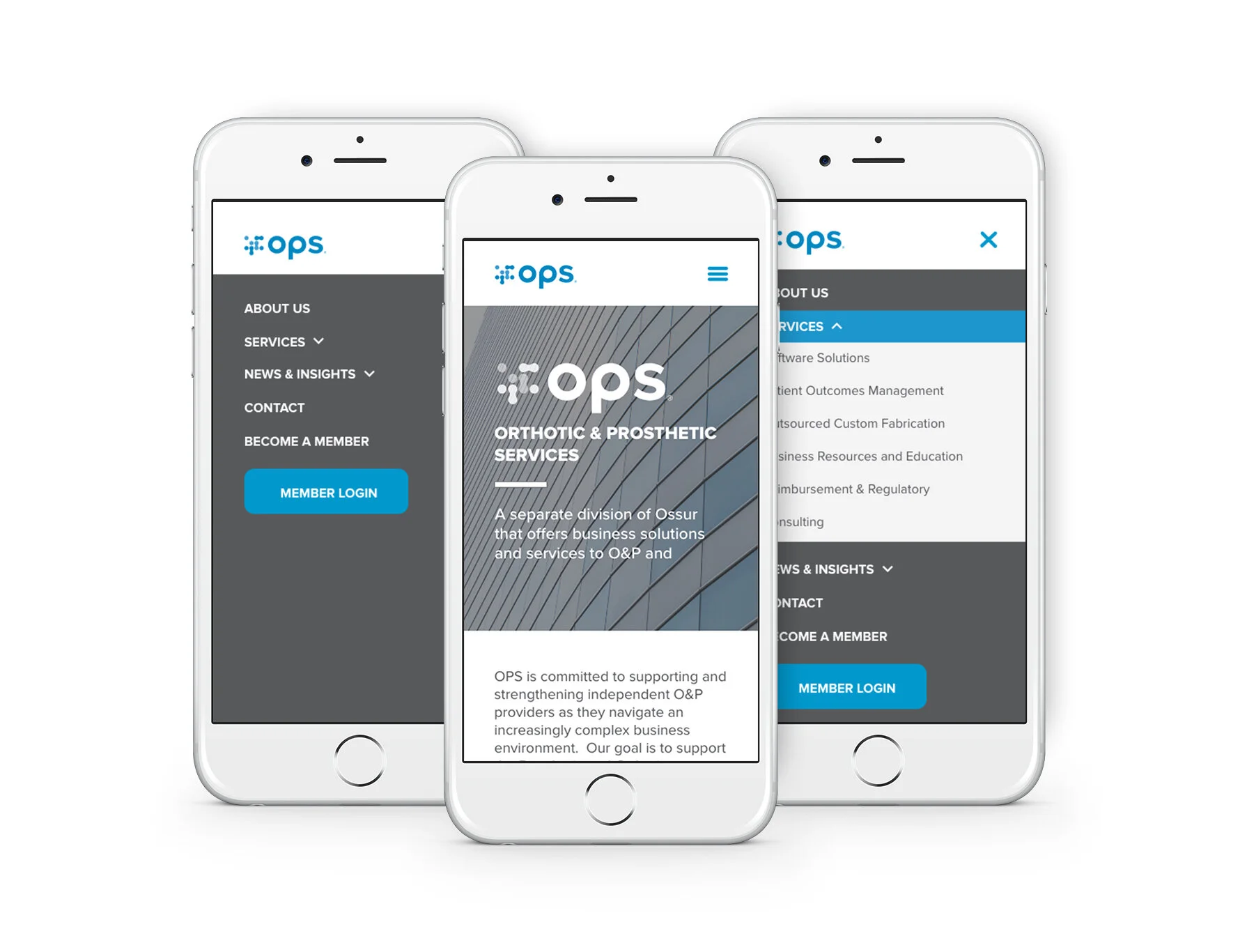
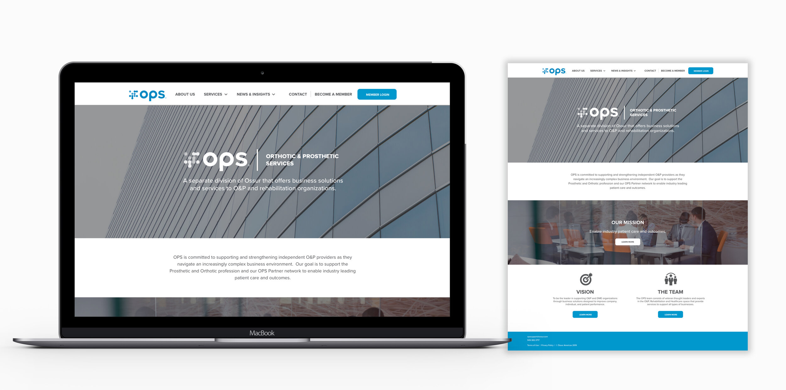
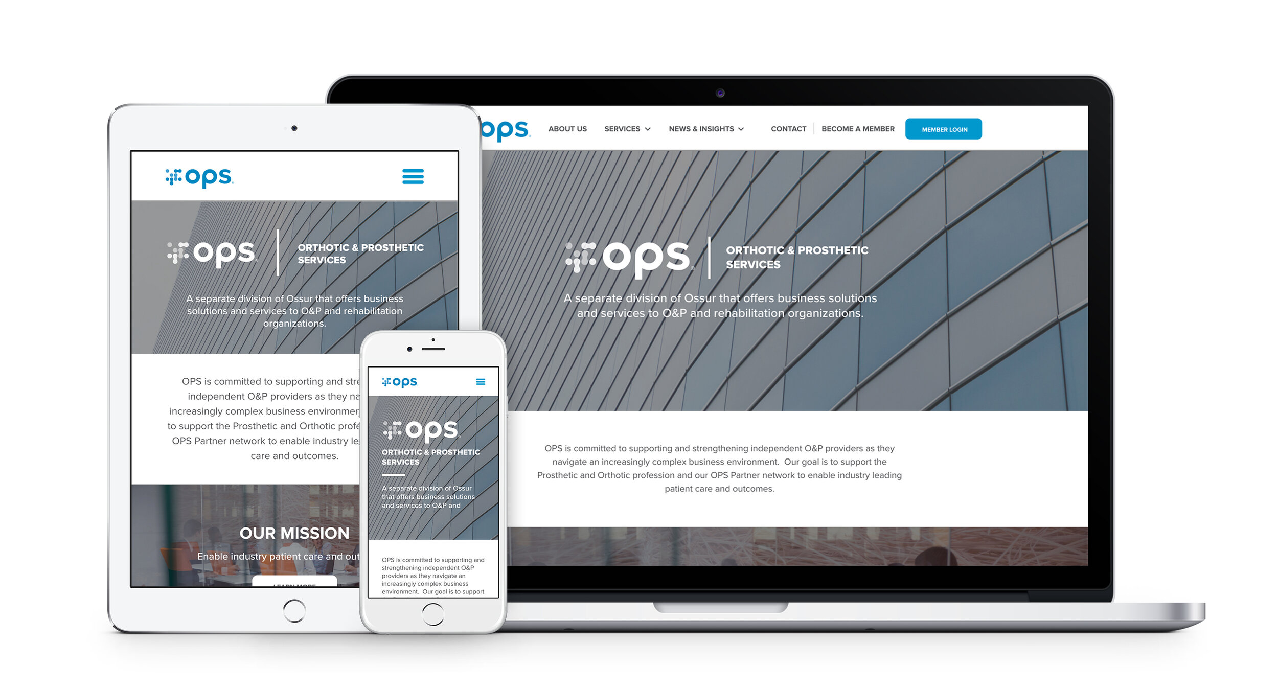
Site refresh
OPS partners access the OPS internal portal through the homepage. Their previous site was not responsive, causing inconvenience for medical professionals who are often on the go. To address this issue, we created a website that can be easily accessed through mobile phones and tablets. Our goal was to provide an effortless user experience without overwhelming the users. We utilized full-width blade sections with whitespace, impactful call-to-actions, and full-width images to achieve this. We also designed icons to highlight the call-to-actions without using full-width sections. OPS is pleased with the new website and also hired us to create additional landing pages for a future project.