
Little Bipsy
Branding Refresh
Partnered with leadership to translate a strong creative vision into a cohesive and scalable brand system, defining visual identity and creative direction across all touchpoints.
ROLE
Senior Brand Designer
SCOPE
Brand Identity • Visual System Development • Creative Direction • Brand Guidelines • Cross-Channel Experience
TOOLS
Adobe Illustrator • Adobe InDesign • Adobe Photoshop • Monday.com
OverviewLittle Bipsy began with a clear and compelling vision: to create modern, minimal essentials for children that balanced style, comfort, and functionality. What started as a small Instagram shop quickly grew into a beloved brand with a loyal following.
As the business scaled, the brand had a strong creative direction but lacked a cohesive visual system to support consistency across digital, marketing, and product experiences.
This project focused on evolving the brand identity into a more refined and scalable system, including logo refinement, creative direction for photography and campaigns, and the development of comprehensive brand guidelines.
ChallengeLittle Bipsy had a strong product and a clear creative vision, but the brand identity lacked consistency and structure to support its growth across channels and physical applications.
One of the primary challenges was the existing logo system, which had been created using a low-resolution, modified typeface. This resulted in inconsistencies across applications, particularly in manufacturing and print, where the logo appeared differently across polymailers, hangtags, and other branded materials.
In addition, brand messaging and typography were inconsistent across channels, leading to a fragmented experience across web, email, marketing, and packaging.
Additional challenges included:
Inconsistent visual hierarchy and logo usage
Lack of defined creative direction across photography and campaigns
No formal brand guidelines to support internal alignment
A growing brand that required a more refined and scalable identity
ApproachBrand Alignment + Audit
I began by aligning with leadership on the core brand vision and auditing existing touchpoints across web, packaging, and marketing. This helped identify inconsistencies in typography, logo usage, and messaging, and defined the key areas for improvement.
Logo + Typography Refinement
I redesigned the logo system using a more refined and scalable typographic approach, replacing the previous low-resolution mark. The updated system ensured consistency across both digital and physical applications, including packaging, print, and marketing materials.
Creative Direction
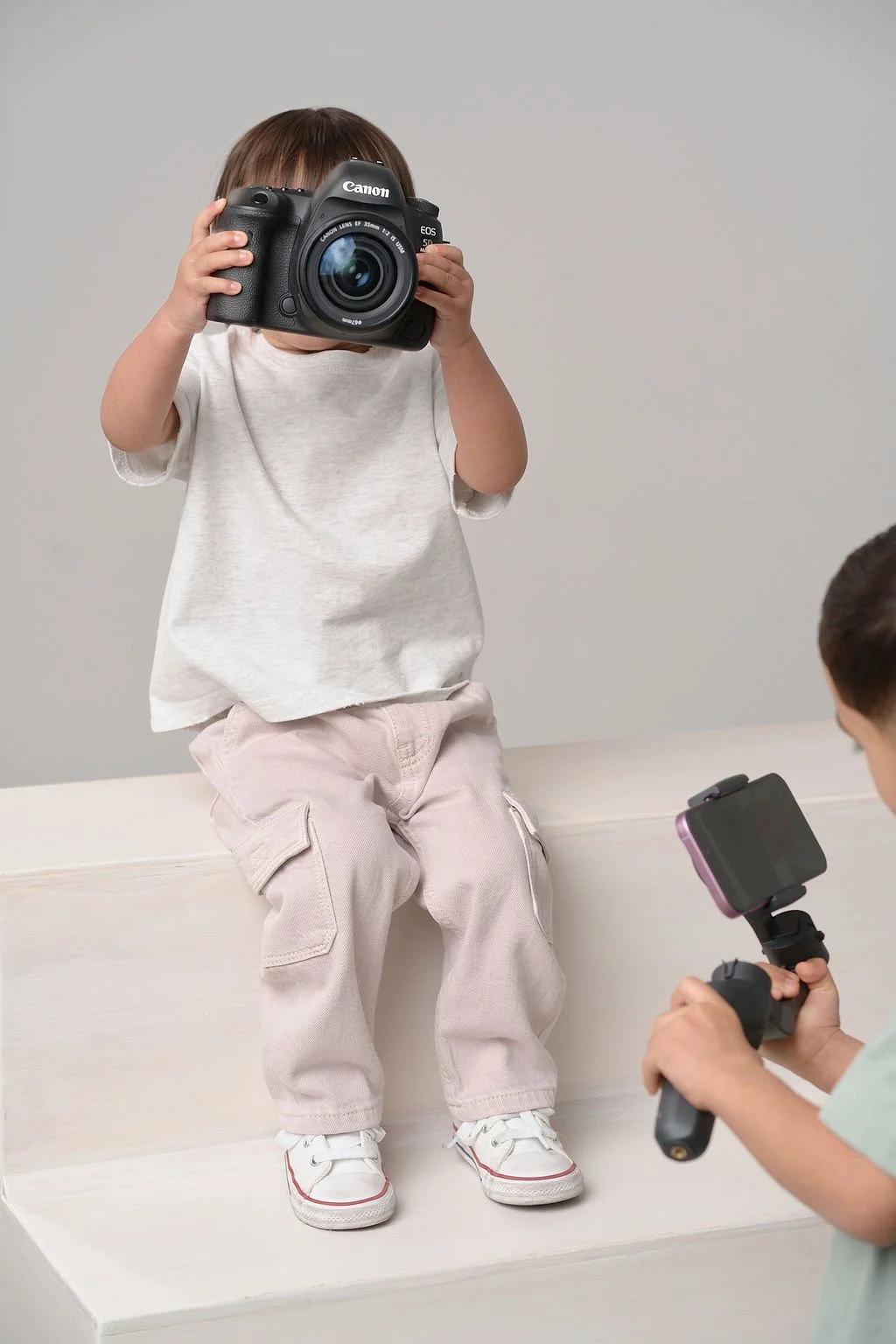
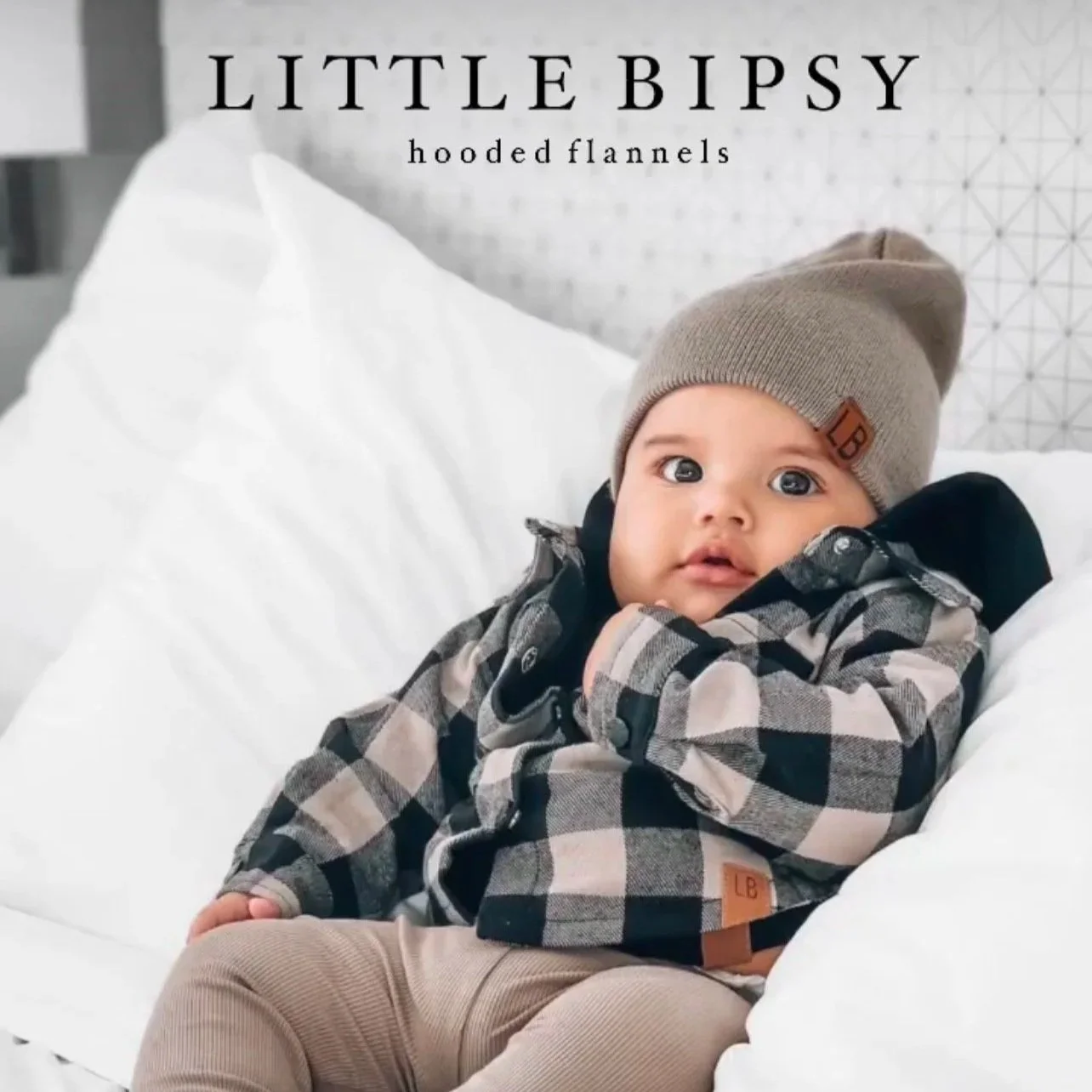
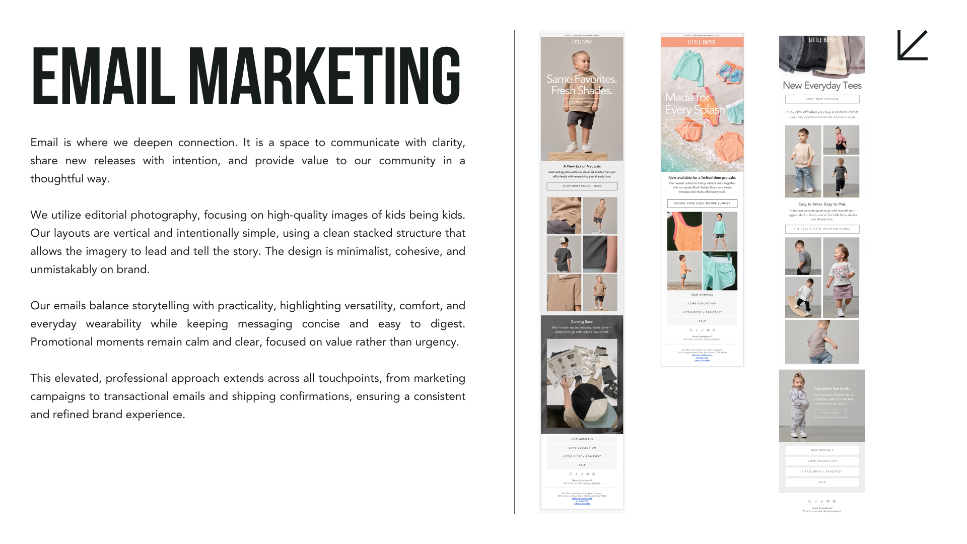
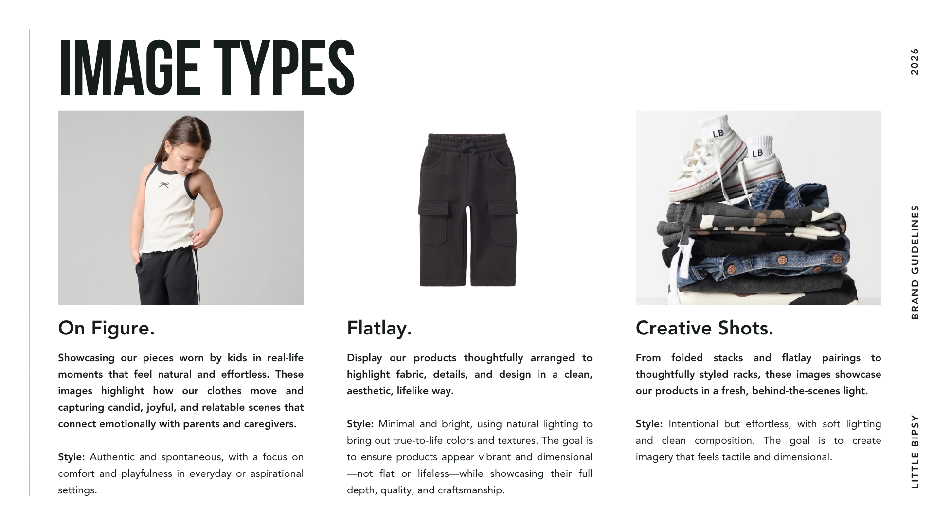
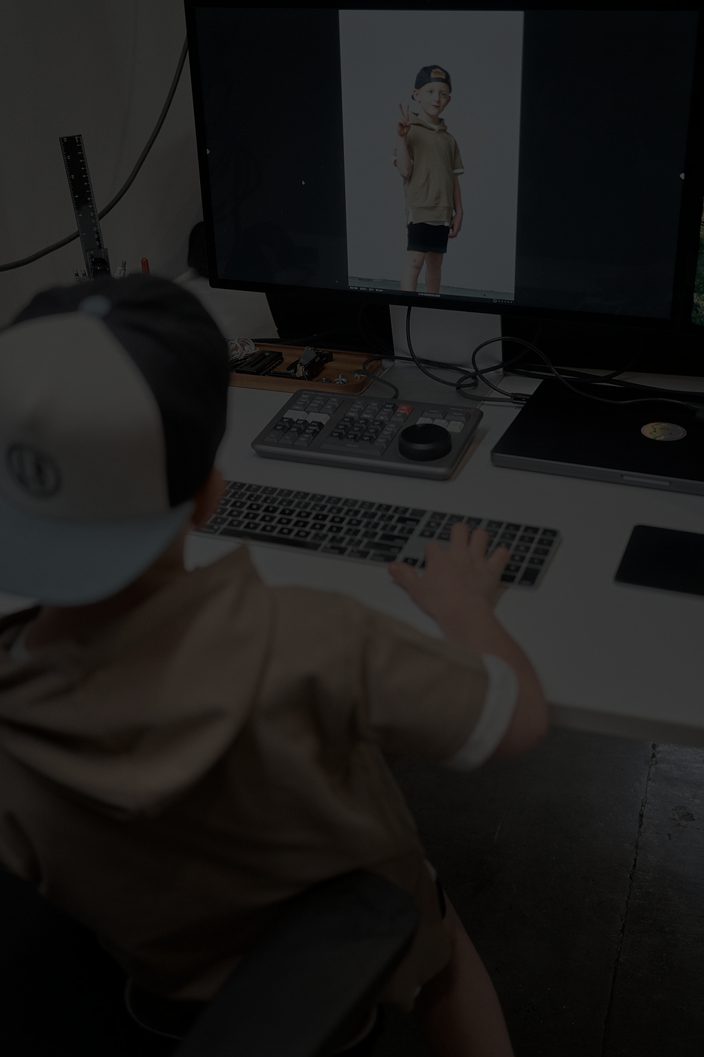
I established a clear creative direction for photography and marketing, defining visual tone, composition, color palette, and styling. This created a more cohesive and elevated brand presence across campaigns and content.
Brand System + Guidelines
I partnered with the marketing team to develop comprehensive brand guidelines, outlining logo usage, typography, color, imagery, and messaging. This provided a scalable framework to ensure consistency across all teams and touchpoints.
SolutionRefined Logo System
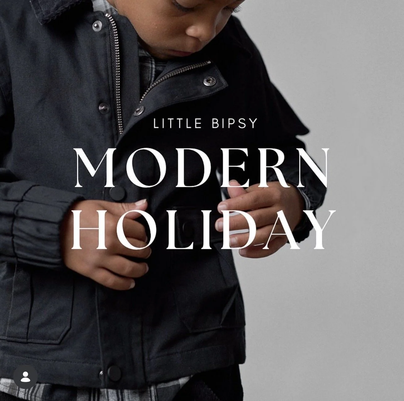
In collaboration with leadership, we evolved the logo to better reflect the brand’s growth, shifting from a more “baby” aesthetic to a modern, elevated identity.
A custom sans-serif wordmark was developed in Illustrator, creating a more structured and versatile foundation while maintaining a distinct, ownable look. The updated logo system ensures consistency across both digital and physical applications.
Defined Creative Direction
A unified creative direction was established for photography and marketing, guiding composition, styling, tone, and imagery. This created a more elevated and consistent brand experience across campaigns and content.
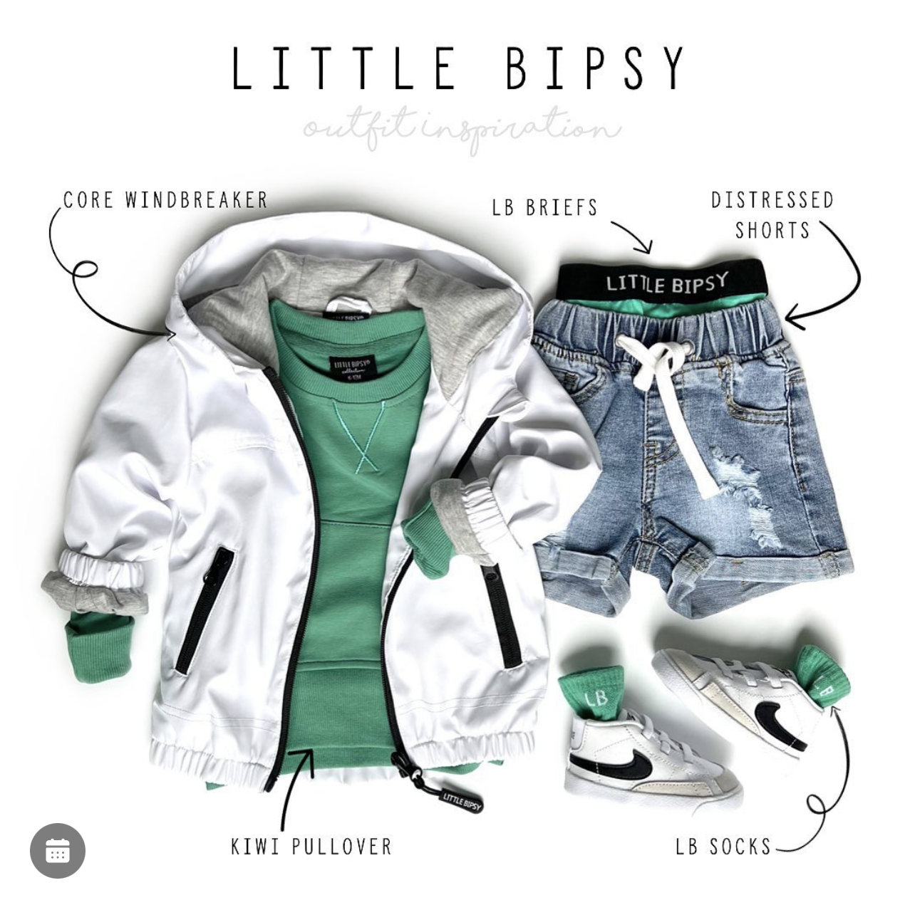
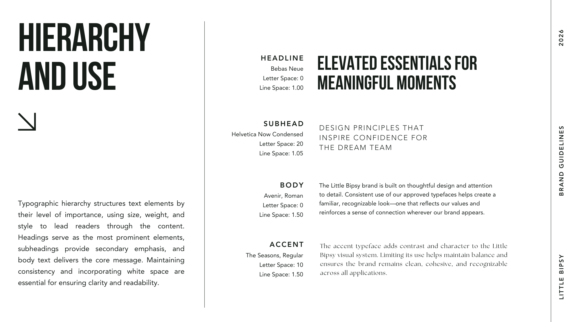
Consistent Typography + Visual Language
A clear typographic system was introduced, creating consistency across all channels. This, combined with a refined color palette and visual hierarchy, established a more cohesive and recognizable brand presence.
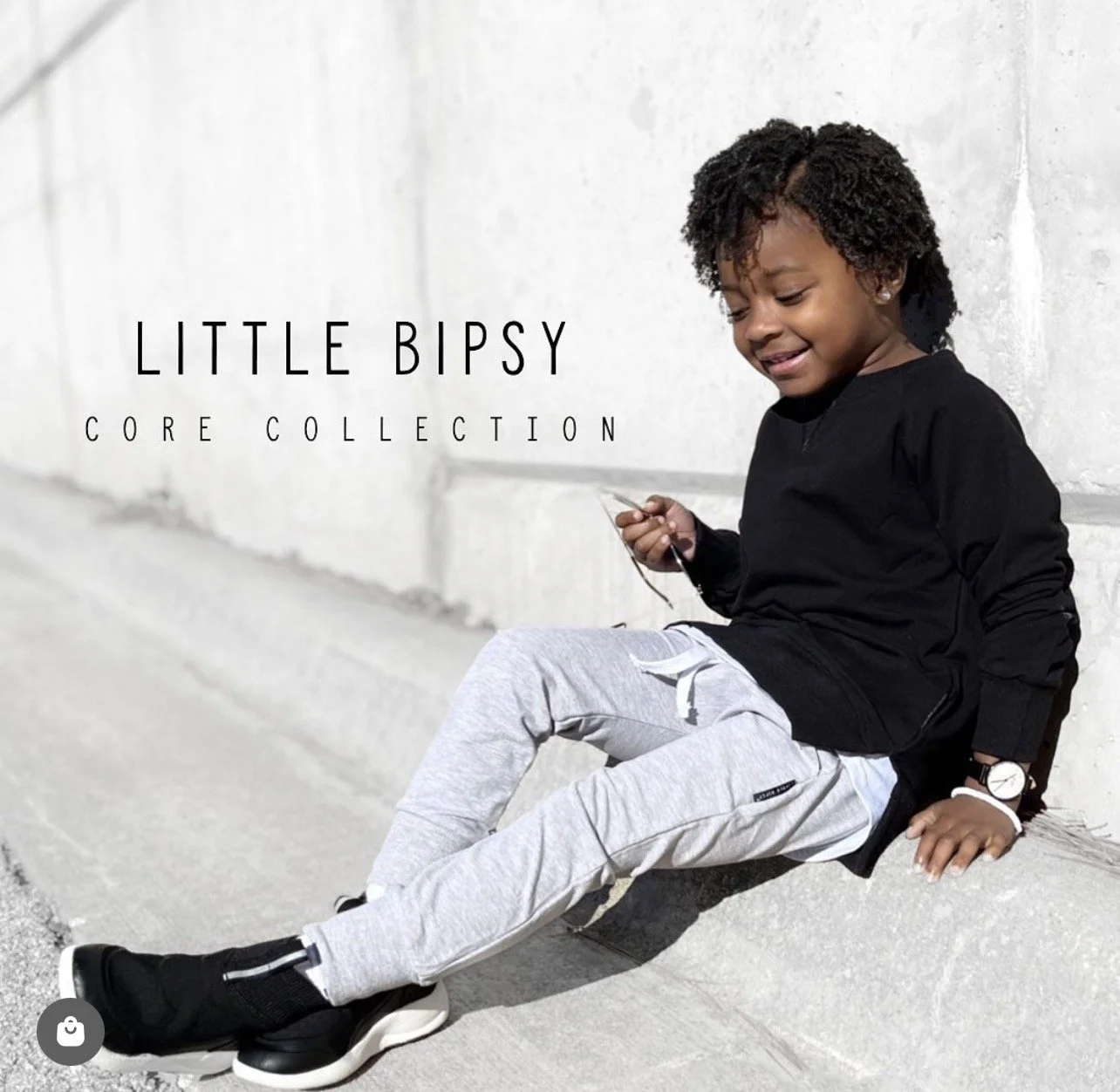
Scalable Brand System
Comprehensive brand guidelines were developed to ensure consistency across teams and touchpoints. This system enabled the brand to scale confidently across web, email, paid media, packaging, and print while maintaining a cohesive identity.
ImpactThe updated brand identity established a more cohesive and scalable foundation for Little Bipsy, enabling consistency across all customer touchpoints.
The refined logo system and typographic approach ensured reliable application across both digital and physical formats, eliminating inconsistencies in packaging, print, and marketing materials.
With a clearly defined creative direction, photography and campaigns became more aligned and recognizable, strengthening the overall brand presence.
The introduction of comprehensive brand guidelines provided internal teams with the tools to execute consistently, supporting more efficient workflows and a unified customer experience across web, email, paid media, and product.
From the Team“I had the privilege of reporting directly to Jamie for 2.5 years at Little Bipsy, where she continues to serve as a Senior UX/UI Designer and goes far beyond her role as a manager. From day one, it was clear that she genuinely wanted what was best for me and was deeply invested in my growth and development as a designer.
Jamie consistently challenged me to elevate my skills, think more critically, and push beyond my comfort zone, while always providing thoughtful guidance and support. She gave me opportunities to stand out, take ownership, and step into leadership, which had a lasting impact on my confidence and growth.
In addition to her mentorship, Jamie is deeply committed to improving Little Bipsy’s ecommerce and overall user experience. She is always focused on making the customer experience the best it can be, thoughtfully identifying and solving problems both big and small with a strong balance of strategy, creativity, and empathy.
What truly sets Jamie apart is her care and intentionality as a leader. She creates an environment where people feel supported, challenged, and empowered to do their best work. I am truly grateful for Jamie’s mentorship, empathy, and unwavering support, and her impact on my growth as a designer will stay with me throughout my career.”

Jenae McKenzie
Graphic Designer, Little Bipsy